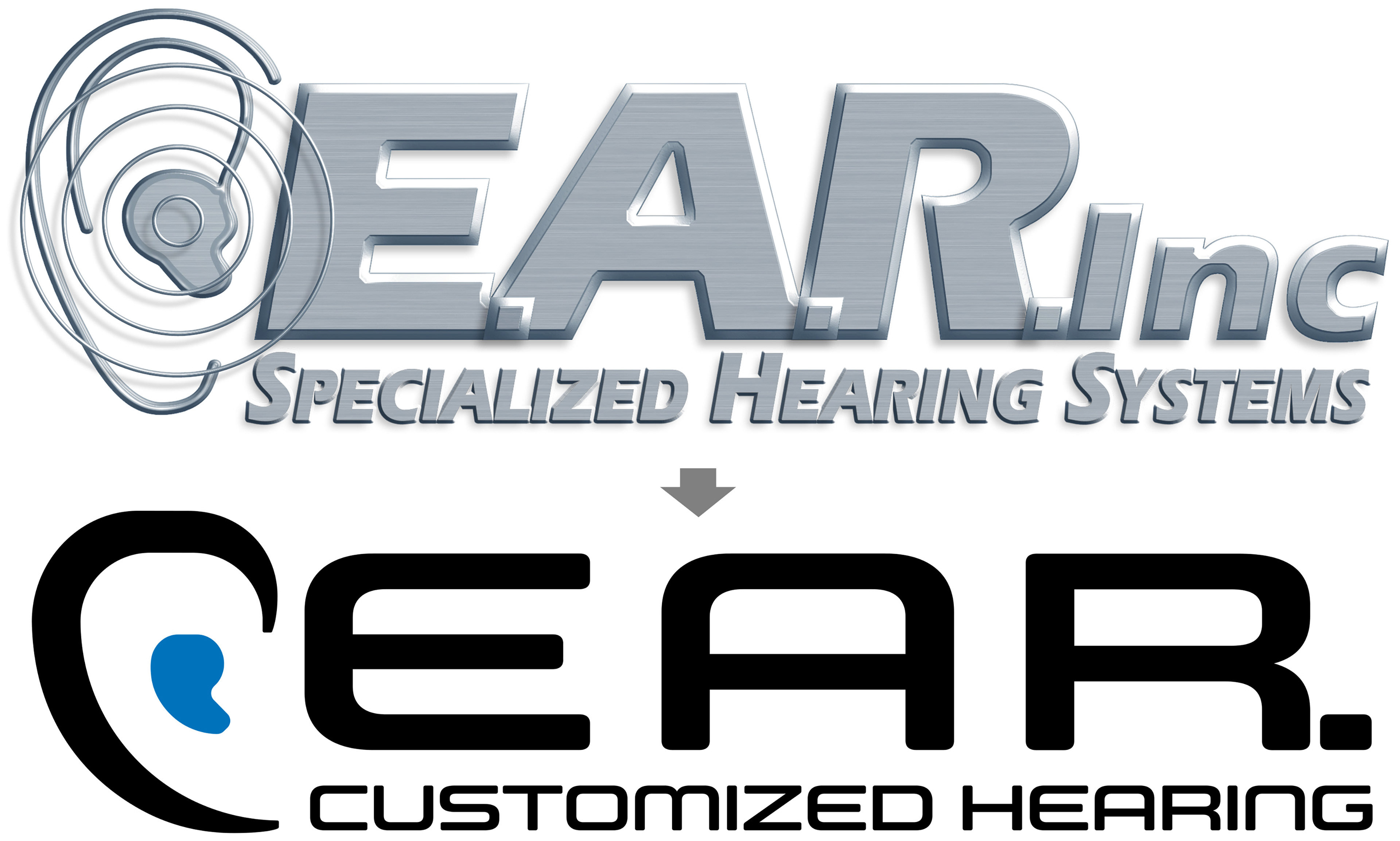
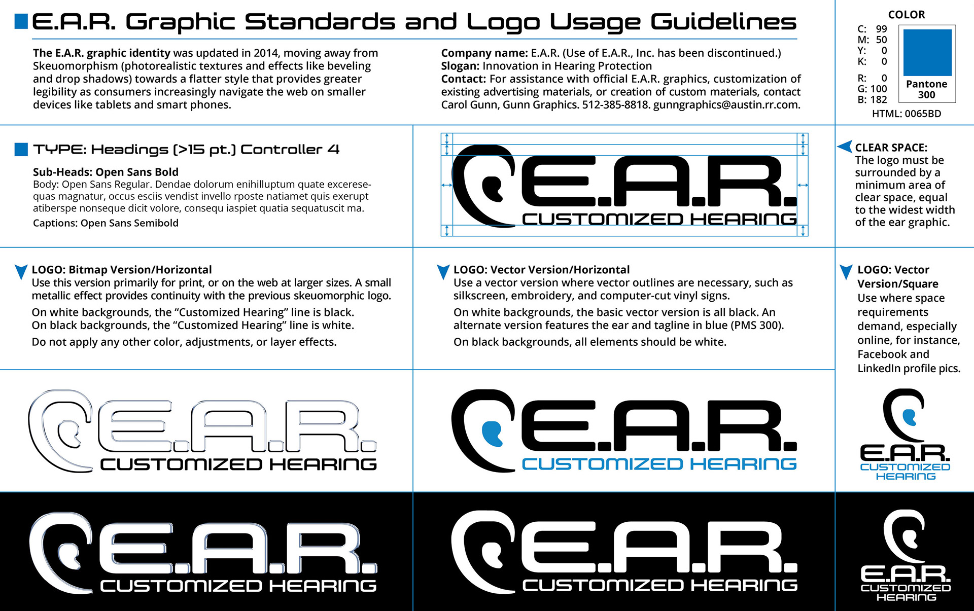
I rebranded E.A.R. Customized Hearing in 2013. Special attention was given to updating the logo as design was going through a major shift from skeuomorphism (realistic textures, beveled edges, drop shadows, etc.) to a more flat style of design that could be better viewed on smaller devices like tablets and cell phones. I created a brief “Style Bible” to maintain consistent branding across print and web.
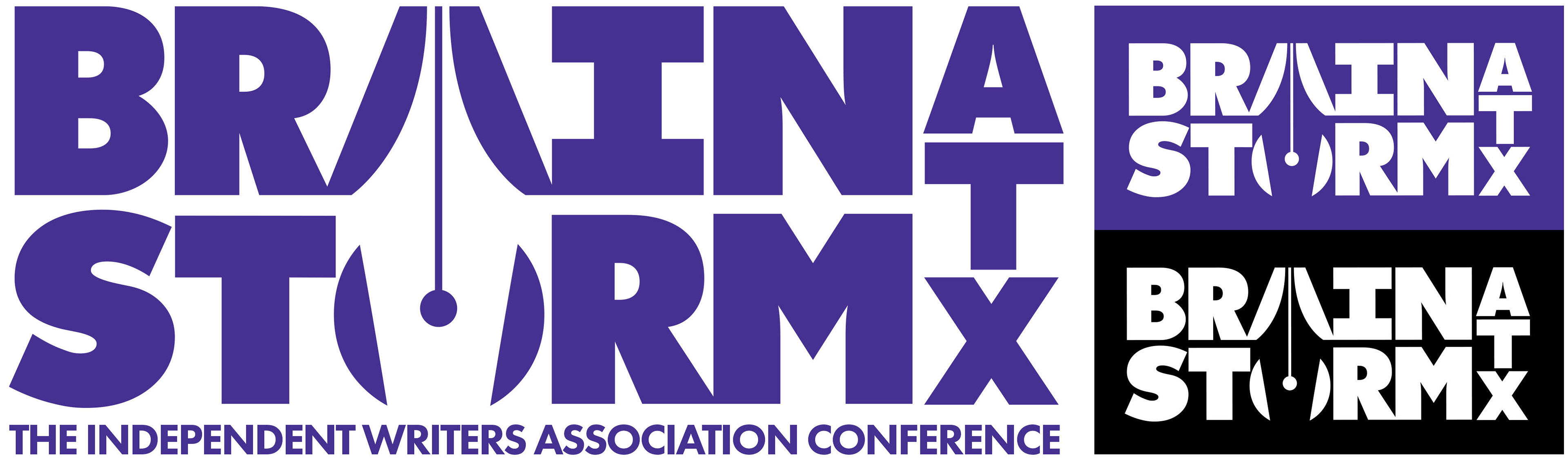
BrainstormATX is a conference for writers. My client gave me only three directives:
1. No brains!
2. No storms!
3. Make it BOLD!
She loved the examples of logos using “negative design” I showed her, and together we came up with the idea of reversing a writer’s pen nib out of the letters ‘A’ and ‘O’. For her color scheme, we chose a web-safe shade of purple that would reproduce similarly in print and on the web.
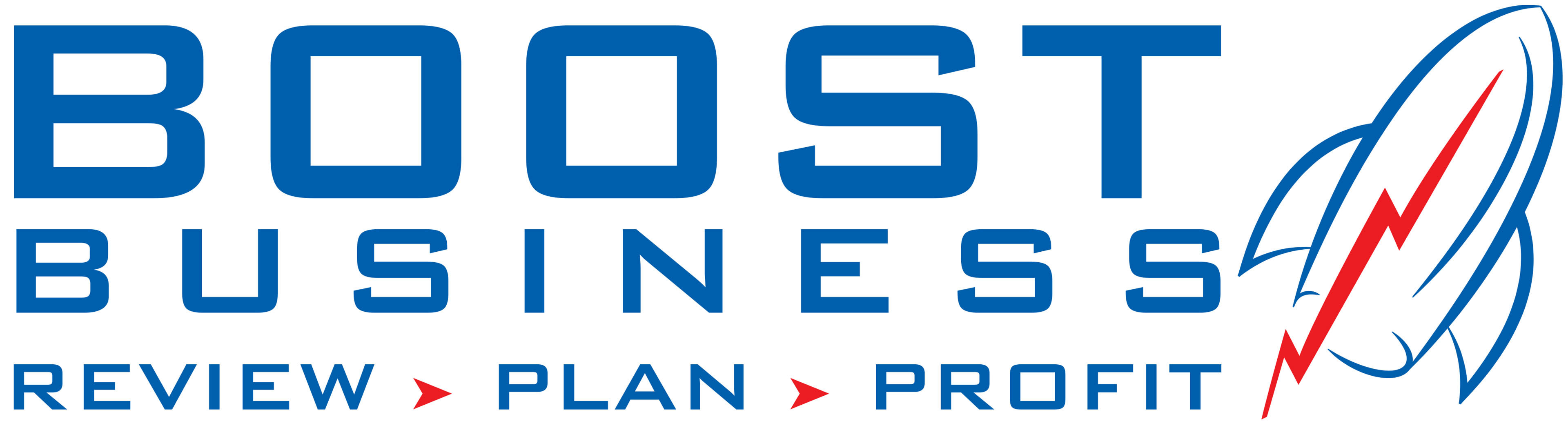
Boost Business had been using a logo based on a clip art graphic of a rising line on a stock market graph. My client wanted to keep the look & feel of the graph line, while making his logo look more unique. So, I created an original graphic of a rocket, and the graph line became its exhaust. For the logotype, we chose Bank Gothic for its no-nonsense stability.
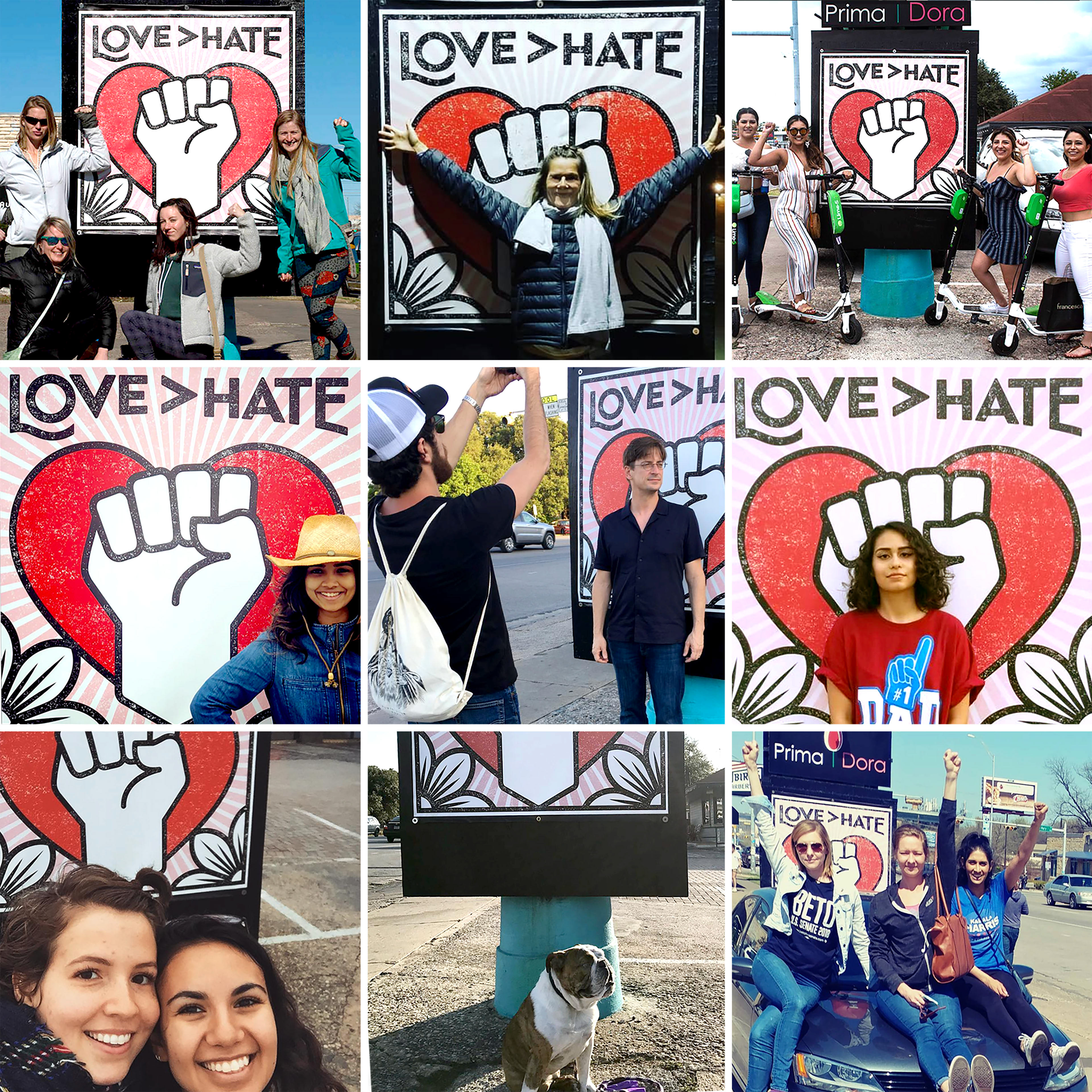
Love > Hate. Believe it or not, the inspiration for this design came from a client assignment to draw caricatures for a computer game called “Punch A Nazi” including Hitler, Neo-Nazis, Skinheads, and the Charlottesville tiki-torch-toting protesters you could punch with a cartoon fist. After researching hundreds of source images (resulting in 6 really good caricatures that will never see the light of day in my portfolio!), it occurred to me that this was not the right way to go about it. As in MLK’s famous quote “Hate cannot drive out hate; only love can do that.” So the fist became a symbol of the power of love.
I also took inspiration from the Shepard Fairey poster on my office wall, “Make Art, Not War” (given to me by my daughter after marching together in the Women’s March).
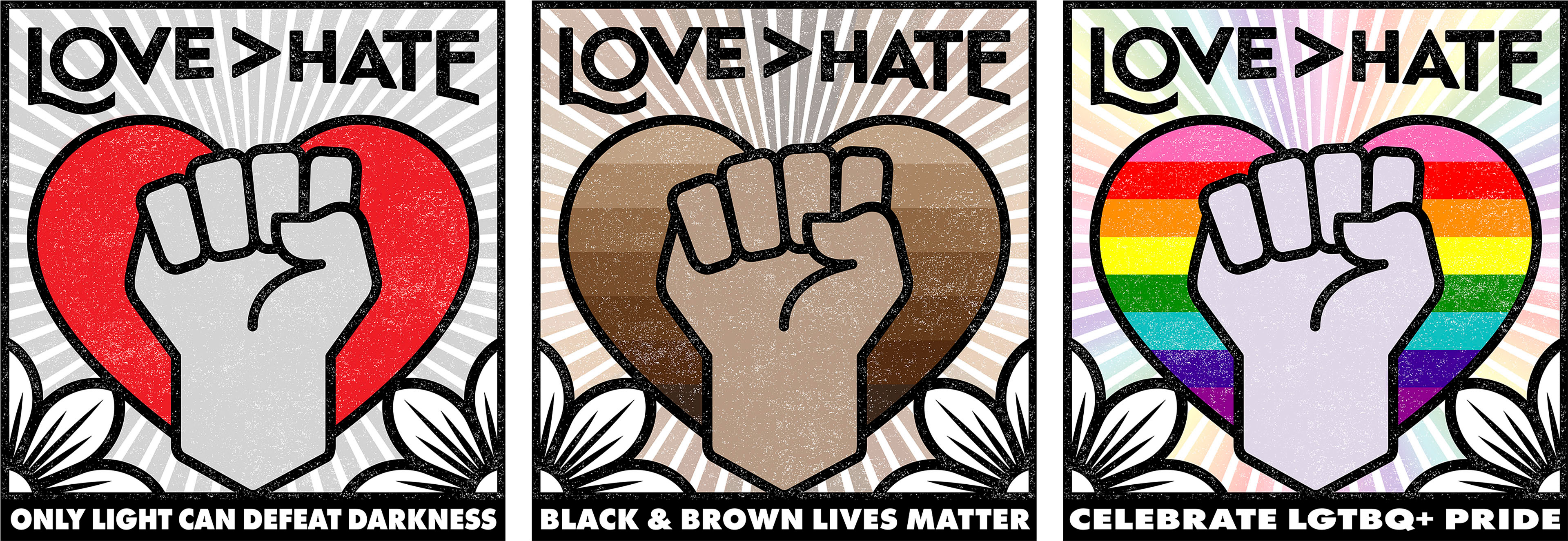
I have recently created two new versions — one with a rainbow for Gay Pride Month, and another with the caption “Black and Brown Lives Matter.”
This design has been a huge hit on social media and has sold well in retail outlets on stickers, metal & enamel lapel pins, yard signs, and prints. The positive response to it has been overwhelming and yes, heart-warming!
Since the 2016 presidential election, much of my personal design work has featured upraised fists, including 28 versions of “Scientists March For Science”, from Archeologists to Zoologists.